- 分享到:
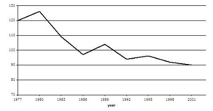
The graph contains information about the population of birds in Europe over a period of twenty four years.
Summarise the information by selecting and reporting the main features, and make comparisons where relevant.
Write at least 150 words.
过渡词很丰富,衔接词同时使用的恰到好处;句法方面做得很棒,但是从句不多;学术词汇积累做的很棒,但总体词汇量稍小。
The graph represents the tendency of changing population of birds in Europe throughout 24 years from 1977 to 2001. Bar the sharp rising in during first one decade, the number of birds generally experienced a downward trend since 1980s until 2001. At the beginning of the statistics, the quantity of birds in Europe enlarged considerably from 120 million (1977), which enabled the avian population rose up to a peak which was above 125 million in 1980. However, ever since then, the population underwent a long-period decrease until 1955. Although it rose up again from 1989 to 1992, the number of birds was still substantially less than that during the end of 1970s, which went on reducing till 2001. In a nutshell, the avian population had dramatically declined throughout the 24 years. The mere twice fine increasing trends during the period fail to reverse the fact that avian population in 2001 is 30 million less than that in 1977.
人气:108发布:2017-03-22
人气:82发布:2014-08-20
人气:66发布:2015-11-21
