- 分享到:
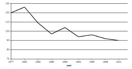
The graph contains information about the population of birds in Europe over a period of twenty four years.
Summarise the information by selecting and reporting the main features, and make comparisons where relevant.
Write at least 150 words.
作者学术词汇使用比较准确,不过文中词汇表达贫乏;作者应增加文中长句和从句和使用;文章层次较为清晰;请注意分段;请提高文章内敛性,段落和句子要围绕主题展开。
The graph shows the bird population in Europe, measured in millions, for the years 1977 to 2001, in three-yearly intervals. Overall, the graph shows the population decreased over time. In 1977, the population was 120 million birds. This increased to a peak of about 126 million in 1980, and then dropped sharply over the next six years to approximately 98 million in 1986. It then rose significantly to about 112 million in 1989. It fell sharply over the next three years to about 95 million in 1992 and remained relatively stable after that at between 96 and 90 million birds. The graph shows a trend of a gradual decrease in the number of birds since 1995.
