- 分享到:
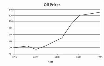
The graph contains information about the price in US dollars of a barrel of oil from 1995 with predictions to 2015.
Summarise the information by selecting and reporting the main features, and make comparisons where relevant.
Write at least 150 words.
如若适当增加一些从句的使用,文章会取得更好的成绩;文章衔接手法恰当;文中词汇表达用的较灵活,同时能够较恰当地使用高级词汇。
The graph shows oil prices in dollars per barrel from 1995 with forecasts to 2015. Overall,oil prices increased by nearly four hundred percent from 1995 to 2008, with the most dramatic increase in the two years from 2006 to 2008. This rise is predicted to continue into the future. The prices in 1995 kept around twenty US dollars, and then it showed a slight growth to approximately twnety three dollars in 1998. The price had been dropping for next two years to the lowest point of about seventeen dollars around 2000. After that, a constant growth on price is indicated and rose to about fifty dollars per barrel in 2007. There was a dramatic rise between 2007 and 2010. At last half decade, the price is predicted to reach the highest point of 130 dollars per barrel.
