- 分享到:
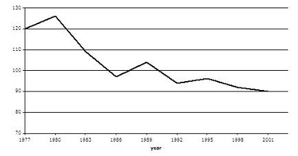
The graph contains information about the population of birds in Europe over a period of twenty four years.
Summarise the information by selecting and reporting the main features, and make comparisons where relevant.
Write at least 150 words.
高级词汇比较灵活,还要请作者增加词汇表达的丰富度;如若适当增加一些从句的使用,文章会取得更好的成绩;过渡词和衔接词使用的比较不错。
The graph illustrates the changes of the population of birds in Europe in the years of 1977 to 2004. It is clear that the population of birds was 120 at the beginning of the twenty four years in 1977. Then it soon reached a peak at about 125 in 1980. After that it dropped dramatically to approximately 97 after six years in 1986. In 1989 it soon increased to roughly 104 .Since 1989 in spite of the fact that it had a little rise during 1992 to 1995 from 94 to 95, it fell slowly from 104 in 1989 to 90 in2001. Overall it indicates that the population of birds in Europe dropped a lot over a period of twenty four years.
