- 分享到:
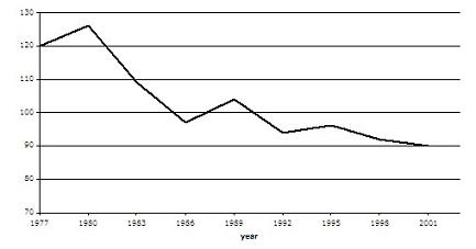
The graph contains information about the population of birds in Europe over a period of twenty four years.
Summarise the information by selecting and reporting the main features, and make comparisons where relevant.
Write at least 150 words.
作者词汇表达较丰富,高级词汇词汇使用准确,但要避免拼写出错;从句使用量不足;建议增加衔接词和过渡词的使用。
The diagram demostrates that the number of birds changed in Europe throughout a period of twenty four years. It is noticeablely that the trend of the population of birds declined considerablely.Only between 1977 and 1980,1986-1989 and 1992-1995,there was a upward trend.Particularly,in 1980 the number of birds reached the peak at about 125 million. By contrast,the 6 years from 1900 to 1986 witnessed a rapid decrease of the population of birds from nearly 125 million to roughly 98 million.In addition,a similar partten was repeated for the number of birds between 1989 and 1992,dropping from about 120 million to approximately 102 million.During 1995 and 2001,the population of birds decreased slightly from about 95 million to 90 million. Overall,the prospect of the population of birds is not optimistic.Numous of birds has dispeared in Europe.
