- 分享到:
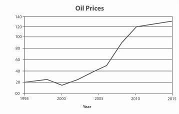
The graph contains information about the price in US dollars of a barrel of oil from 1995 with predictions to 2015.
Summarise the information by selecting and reporting the main features, and make comparisons where relevant.
Write at least 150 words.
过渡词很丰富,衔接词同时使用的恰到好处;可增加从句和复杂句的使用;能较灵活地使用部分学术词汇,有基础拼写错误,需要注意一下。
Given is the figure concerning the oil prices in US within a certain period which incepted at 1995 with predictions to 20 years later. It is evident from the information provided that despite the shortly drawdown during 1998 to 2000,the tendency of the oil price per barrel represents a dramatical increase in general,especially from 2000 of rarely 20 dollars to 2010 of 120 dollars.The degree of slope of the price saw the most abrupt within 2006 to 2010.This is followed by a 5 years largo augment and reaching its peak in 2015,at 130 dollars per barrel. Also noteworthy is the fact that the costs may enjoy a more further forecast depending on the trend stamped,although slowly,there is no indication of alleviation.
