- 分享到:
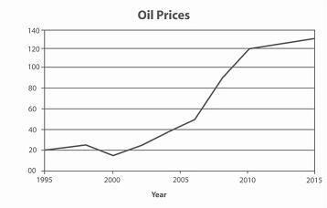
The graph contains information about the price in US dollars of a barrel of oil from 1995 with predictions to 2015.
Summarise the information by selecting and reporting the main features, and make comparisons where relevant.
Write at least 150 words.
作者学术词汇表达灵活,不过请增加词汇量的积累;行文较为流畅,作者文中过渡词使用的不错;丰富从句的使用,文章会更出色;请注意分段。
As the table represented that the trendency of the oil price from 1995 to 2014 and the prediction to 2015.From 1995 to 2000,there has gone through two phase:raising steadily until 1998,with the 25 based on 20 in 1995,while fell to under 20.And from 2000 to 2007,it has been raised markedly from the low base of 15 nearly in 2000,which has been increased to 50 approximately.Compared with the second period,the third period,from 2007 to 2010,keeping the pace of increasing oil price,and the rate of growth has been increased sharply.Collected from 2010 to 2014,the oil price still sustain its move to increase,while it has been increased more steadily than the thied period.Specific data was:from 120 to 130.Under the prediction of experts,the oil price in 2015 will be placed in the liner of the third period. Overall,the significant changes in oil price is one profile of the supply and demand in the resource over 2 decades.
