- 分享到:
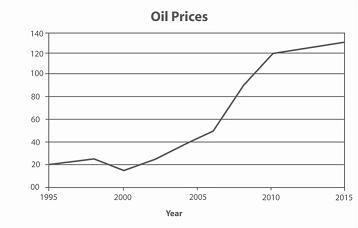
The graph contains information about the price in US dollars of a barrel of oil from 1995 with predictions to 2015.
Summarise the information by selecting and reporting the main features, and make comparisons where relevant.
Write at least 150 words.
文章学术词汇使用熟练,但请作者增加词汇丰富度;文中从句的数量太少;结构不严谨,几乎没有使用衔接词,上下文衔接欠流畅。
The curve graph illustrates the oil prices in US dollars since 1995 to 2015. It is clear that the oil prices made a unsteady increase since 1995 to 2010.In 1995, the oil prices decreased about 20 to 18 in 2000. In 2000 this figure sharply rise to 18 and 120 until 2010.But after 2000, the number of the oil prices slowly increased 120 to 130 until 2015.In fact,It is obvious that the oil prices figure the level off increased since 1995 to 2015. Overall,the oil prices felled significant throwout the period.However,the oil prices of the peat of during the whole period.
